Introduction
When we manage online stores or websites, tracking where users get stuck is pretty simple. We look at click rates, check where people exit the page, and use digital heatmaps to see where they scroll. But in a physical, brick-and-mortar store, understanding how people move has always been a guessing game. For years, retail managers had to walk around with clipboards or rely on gut feeling to guess which aisles were working and which ones were ignored.
Recently, a clothing and grocery retailer decided to change that. They took 90 days of video footage from the security cameras they already had installed and ran it through modern AI powered video analytics. By turning regular video into simple visual maps, they learned exactly how shoppers behave inside a store. Here is what that data revealed.
What a Retail Heatmap Actually Shows
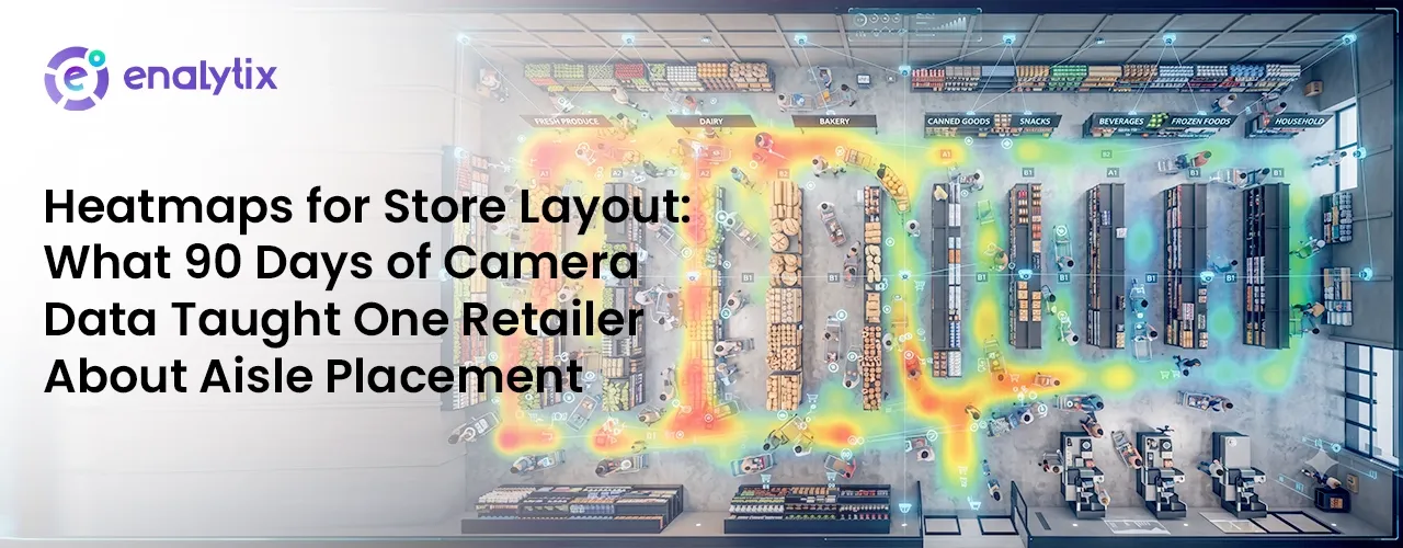
A retail heatmap isn’t complicated. It’s just a colorful layer placed on top of a store’s map that shows where people walk and stand. While a basic retail footfall counter software at the entrance can only tell you how many people walked into the store, store analytics heatmap tools go much deeper. They track two main things: traffic volume (how many people pass by) and dwell time (how long they actually stop).
The software securely tracks movement and turns time spent in an area into colors. Heavy traffic and long stops show up as “hot zones” (bright red and orange), while ignored spaces stay “dead zones” (cool blue). This gives brands a clear picture of customer journey analytics in retail without needing any fancy or expensive new gadgets.
Reading Hot Zones vs Dead Zones
When the retailer first looked at the data, they assumed every red spot was good and every blue spot was a failure. But they quickly realized that reading a heatmap requires understanding human psychology.
For example, the biggest red hotspot on the map was right inside the main entrance. At first, it looked like customers were loving the products placed there. In reality, it was just a “decompression zone”—the space where people naturally slow down, adjust to the indoor lighting, and look around to figure out where to go next. They weren’t looking at the products; they were just orienting themselves.
True hot zones are deeper in the store, where people actually stop to browse a shelf. On the other hand, blue dead zones showed exactly where the layout was failing—like corners where bad lighting or tight corners made shoppers turn around and walk away before even seeing the items.
Case Study: The 90-Day Aisle Optimization Experiment
To see how this data actually helps a business, let’s look at what this retailer did over 90 days. They used an in-store people counting system to track behavior across three distinct phases.
Phase 1: Days 1-30 ➔ Find the bottlenecks and find out why the center aisle is empty.
Phase 2: Days 31-60 ➔ Move displays, tilt shelves 45 degrees, and change product locations.
Phase 3: Days 61-90 ➔ Check the new heatmap and see a 14% jump in foot traffic.
During the first 30 days, the data showed a massive problem: almost 73% of customers completely ignored the middle aisle, which actually held the store’s highest-profit items. The heatmap revealed that a giant promotional display near the front door was blocking the view, forcing everyone to walk along the outer walls instead.
On day 31, the manager made three simple changes based on the camera data:
- They cleared the entrance zone, moving the big display stands deeper into the store so the view was wide open.
- They turned the inside shelves at a 45-degree angle. This way, as customers walked down the main path, they could easily see inside the middle aisle out of the corner of their eye.
- They moved everyday staple items (things people always buy) right into the center of that empty middle aisle to pull traffic into the dead space.
By day 90, the data showed a complete transformation. Foot traffic into the center aisle jumped by 14%. More importantly, when they checked their daily sales numbers, they found that because people were spending more time in that high-profit aisle, the average amount spent per customer went up significantly.
Measuring the before/after impact
By day 90, the data showed a complete transformation across the floor plan. Foot traffic into the center aisle alone jumped by 14%, which completely changed the baseline movement of the entire store. But the real validation came when the store manager cross-referenced these new movement maps with their point-of-sale cash registers at the end of the week. They found a massive financial shift that matched the color changes on the screen. Because people were now taking their time and spending more minutes in that specific high-profit corridor instead of just rushing past it, the average basket size per customer went up significantly.
Shoppers started picking up items they usually overlooked simply because they had the physical space and the visual angle to notice them. Instead of a few popular products carrying the bulk of the revenue, sales became much more evenly distributed across the entire shelf setup. The entire project proved that minor tweaks in physical design can trigger major changes in how people buy. In fact, the profit generated from those newly discovered conversions allowed the layout change to pay for itself in just a few weeks, turning a blind spot into the most profitable zone in the building.
Common Mistakes When Interpreting Camera Analytics
While using retail store performance analytics is incredibly helpful, it is easy to misinterpret the data if you aren’t careful.
The biggest mistake is confusing a delay with actual popularity. For instance, a bright red spot would often appear right near the checkout counters. A quick look might make you think customers love that area. But in reality, it was just a long queue because the cash register was slow. Customers were standing still because they were stuck in line, not because they wanted to buy something. Treating a bottleneck as a “high-engagement zone” will ruin your data.
Another mistake is trying to get rid of every single blue zone. A store needs “quiet” or empty space. Wide walkways, clear paths to emergency exits, and open areas near trial rooms are necessary to keep the store comfortable. If you crowd every square foot with products just to turn a blue zone red, you’ll make the store feel claustrophobic, and shoppers will leave faster.
Ultimately, the gap between online tracking and real-world shopping is disappearing. The future of retail belongs to businesses that use simple video intelligence to understand physical shoppers just as clearly as website visitors. By keeping dashboards simple for managers on the ground, these smart tools easily become a natural part of running a successful everyday business.
Leave a Reply